One of the many reasons why I decided to self-publish Storytellers rather than go the traditional agent > editor > publisher route are my control issues is my love for the art of cover design. When you have a traditional publisher, you have very little say as to how your book will be promoted, marketed… and how it is going to look. I don’t mind the first two, but the cover is my baby. Which means I am revealing my baby to you. Hey, at least there was no gender reveal party!
Here’s the cover – click through to read more about the design process, upcoming audiobook, and all other formats.

Designing Storytellers
The cover picture was taken by Hallgrímur P. Helgason, my favourite Icelandic photographer. I told him that I was looking for a photo that looks like a deserted house in the middle of nowhere (which is more or less Gunnar’s address). I forgot to mention I was also hoping for the Northern lights to make an appearance. Hallgrímur offered me four photos, two of which came with delightful aurora in full bloom. I was very tempted to create four different covers because his photographs are so gorgeous, but settled for the one above.
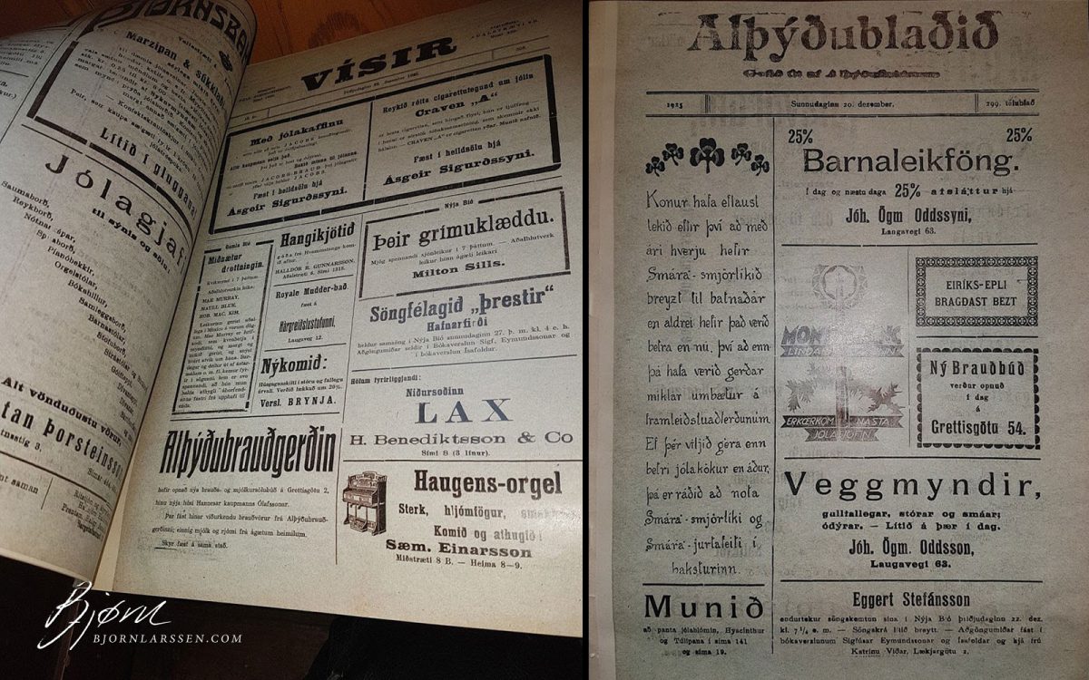
The next was styling. Since Storytellers is historical fiction (even if it’s not your typical historical fiction book, largely because of that elf and the Conservative Women of Iceland), I had to decide whether to style it so that it would look like a cover from the 1920s. The first problem would be, of course, using a full colour photograph – or, in fact, any photograph at all. The second were the fonts. I went through the Icelandic newspapers from the right time period, looking at the typefaces.
They didn’t work.
Beautiful, but…
The photograph is undeniably not something you would see in the papers or on the book covers from the 1920s. Putting together this colourful image with the old typefaces felt very forced, as if I were saying “look, this IS a historical fiction novel, see, the font is all historical and stuff”. Making the picture sepia or even adding a filter would destroy it. I had to find another way.
Baskerville (the font used for the name, its bold version for the words “a novel”) was an easy choice once I dropped the 1920s newspapers look. It’s a typeface associated with historical fiction, one that works both on the inside and on the outside of the book. The title was a problem that took me weeks to resolve. (Why, yes, I am a perfectionist. How did you know?)
I went through the old typewriter styles, various handwritten fonts, I even tried to draw a “logo” myself. I kept having the feeling of being almost there. “Almost” makes a great difference. I can’t remember how I finally bumped into the typeface that was just right: handwritten, contrasting, yet fitting with the rest of the design, suggesting a story being told rather than typed or published as an old book. At the same time, I settled on the colour palette: the deep blues and greens of the Northern lights, and gold.
Audiobook
I think the last time I bought an audiobook was about 15 years ago – it came, if I remember correctly, on 12 CDs. The inconvenient format was slowly dying before downloads and streaming were introduced. In 2019, you can log in to Audible and listen to the book you want on your phone or computer. As a result, “reading” doesn’t necessarily mean actually sitting down with a book and staring at printed words anymore. Half of the members of a book club I am a member of listen to their books.
I intend to produce the audiobook myself. Not just because I am looking forward to voicing the Conservative Women of Iceland, although I’ve already been walking around the house suddenly bursting into Thóra’s voice and shocking Husby. It’s also partly because the person narrating the book must be able to pronounce, or at least not mispronounce too badly multiple Icelandic phrases, switching between accents often within one sentence. (The upcoming March newsletter will feature a little guide to Icelandic pronunciation.)
The book will also be accompanied by an official soundtrack album. Both the soundtrack and the audiobook are coming this spring, with exact dates to be confirmed.
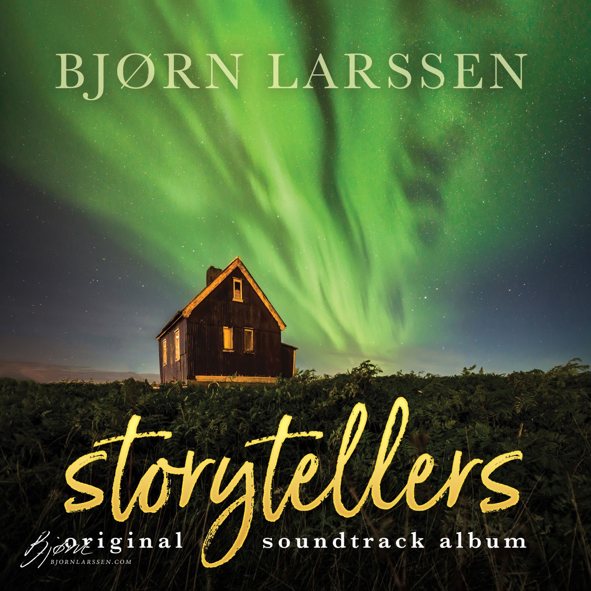
Soundtrack cover art
Release
The following formats will be available: e-book, paperback, hardcover, large print edition, deluxe boxed set, and a super deluxe boxed set (limited to 10 copies).
The e-book will remain a Kindle/Kindle Unlimited exclusive for the first three months. On July 1 the e-book will receive the full (“wide”) release on all other e-book stores, such as Apple Books, Kobo, Google Play Books, etc. Signed and special editions will be available through this website, all other formats will be found at your favourite virtual store.